Introduction
Sports have always been a captivating arena where physical prowess, skill, and strategy converge to create moments of pure excitement. Their uniform is at the heart of every team’s identity, representing their spirit and distinctiveness. In this regard, the Vegas Golden Knights have crafted a uniform that embodies their team’s essence and resonates with fans and spectators alike.
A Brief History of the Vegas Golden Knights
As an expansion team, the Vegas Golden Knights burst onto the National Hockey League (NHL) scene in 2017. Their arrival marked a milestone for Las Vegas—an iconic city renowned for its entertainment and vibrant energy—by bringing professional ice hockey to this glimmering desert oasis. The franchise’s inception was met with great anticipation and excitement among locals and hockey enthusiasts worldwide.
Under the leadership of owner Bill Foley and General Manager George McPhee, the Golden Knights embarked on an extraordinary journey that saw them defy all expectations in their inaugural season. Their remarkable performance on the ice captured hearts, propelling them into the Stanley Cup finals—an unprecedented achievement for an expansion team.
Throughout their short but eventful history, the Golden Knights have embraced Las Vegas’ unique spirit by embracing a motto of resilience and determination. They have quickly become synonymous with perseverance in the face of adversity, embodying what it truly means to be a “Vegas Strong” community.
The Importance of Uniforms in Sports and Team Identity
Uniforms are integral to any sport, serving multiple functions beyond identifying players on the field or ice. A well-designed uniform can evoke emotions from both players and fans alike while fostering a sense of unity among teammates. In professional sports, uniforms symbolize a team’s identity, representing their history, values, and aspirations.
They become an essential part of the team’s brand and often become iconic in their own right. Think of the distinctive pinstripes of the New York Yankees or the iconic green and gold of the Green Bay Packers. These uniforms are instantly recognizable and carry a legacy beyond the game itself.
Uniforms also play a crucial role in creating an intimidating presence on the field or ice, setting the tone for competition. Through design elements such as color schemes, logos, and patterns, teams can establish a visual identity that strikes fear into opponents or instills confidence in their own players.
Moreover, uniforms have significant commercial value as they become highly sought-after merchandise for fans to wear with pride. Fans proudly donning their team’s colors not only show support but also become ambassadors for the franchise wherever they go.
Uniforms are far more than outfits worn by athletes; they encapsulate a team’s spirit, inspire fans’ loyalty, intimidate rivals, and become treasured symbols of unity and identity. The Vegas Golden Knights uniform is no exception to this dynamic relationship between sports attire and team culture—it embodies the strength of Las Vegas while igniting passion within players and fans alike.
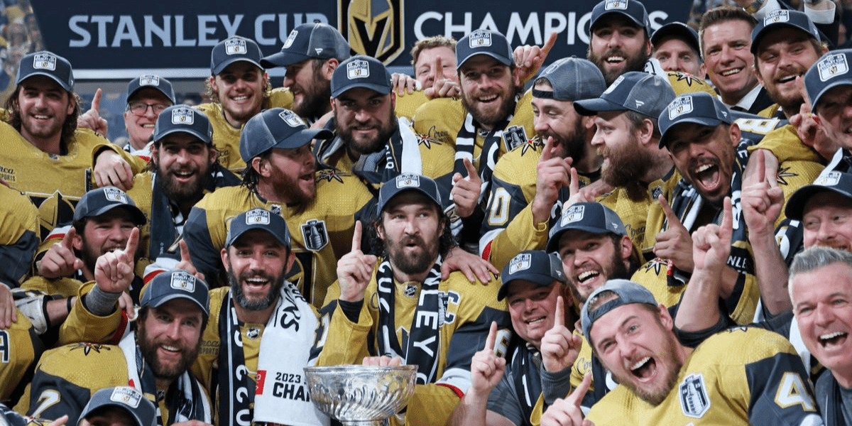
Overview of the Vegas Golden Knights UniformsPrimary colors: Steel gray, gold, and black
The Vegas Golden Knights have carefully selected a color scheme with sophistication and strength. The primary colors used in their uniforms are steel, gray, gold, and black. These shades complement each other perfectly and resonate with the team’s identity.
The steel gray signifies resilience and determination, while the bold gold symbolizes prestige and excellence. Additionally, using black adds a touch of intensity and creates a striking contrast against the lighter tones. Logo: Combination of a knight’s helmet, crossed swords, and a star
The emblem that proudly sits at the forefront of the Vegas Golden Knights jerseys blends several powerful symbols. The focal point is a knight’s helmet—a timeless representation of chivalry, honor, and bravery.
Crossed swords that signify strength in battle and team unity are flanking this centerpiece. Above it all shines a radiant star—an homage to Las Vegas’ iconic nickname, “The Entertainment Capital of the World.” This dynamic combination captures the team’s warrior spirit on the ice and its bond with its vibrant home city. Home jersey design: Steel gray with gold accents and black trim
The home jersey design for the Vegas Golden Knights showcases an elegant balance between subtlety and flair. The dominant steel gray color is a foundation for this masterpiece—a testament to their unwavering determination on home ice. Intricate gold accents gracefully adorn various parts of the uniform, from stripes along the sleeves to small touches highlighting key elements like logos or players’ names.
These golden details add an element of richness to their appearance while further emphasizing their standards for excellence. The judicious use of sleek black trim completes this compelling visual composition, giving the home jersey a refined and powerful aesthetic. Away jersey design: White with steel gray accents and black trim
The Vegas Golden Knights’s away jersey design provides a refreshing contrast to their home attire. It features a predominantly white base—a symbol of purity and clarity that stands out against the sea of colors on opposing ice. Steel gray accents are carefully incorporated, lending depth and continuity to their uniform collection.
These accents remind them of their unwavering identity wherever they may be playing. Like the home jersey, black trim is strategically placed to add definition and sharpness, resulting in a stylish and formidable away uniform.
Helmet Design
Resembling the Resilience of Armor
The helmet design of the Vegas Golden Knights is an integral part of their overall uniform, contributing to their fierce and powerful image on the ice. Its unique metallic finish sets it apart, which emulates the resilience and strength of a knight’s armor.
The reflective surface adds a striking visual appeal and symbolizes the team’s indomitable spirit. Just as knights relied on their armor for protection, the Golden Knights drew inspiration from this historical symbolism to fortify themselves in their quest for victory.
A Gleaming Gold Visor
The Golden Knights’ helmets feature a captivating gold visor to enhance their distinctive appearance and maximize visibility on the ice. This bold choice is a fashion statement and has practical advantages during gameplay.
The golden hue catches natural and artificial light sources, creating an eye-catching spectacle that demands attention. This added flair helps players stand out and instills confidence as they take to the rink.
A Symbolic Touch: The Significance of Gold
Gold has long been associated with prestige, wealth, and victory. In selecting a gold visor for their helmets, the Vegas Golden Knights intentionally incorporate these symbolic associations into their uniform design.
The radiant gleam reminds players and fans alike that they are partaking in an extraordinary pursuit that requires unwavering dedication, skill, and triumph over adversity. Through this deliberate inclusion of gold in their helmet design, the Golden Knights aim to embody an aura of dominance that permeates every aspect of their performance.
The Psychological Impact
Beyond its aesthetic qualities, there is evidence suggesting that helmet design can psychologically affect players and opponents. The metallic sheen and gold accents of the Golden Knights’ helmets serve to intimidate opponents, creating a psychological advantage before the puck even drops.
The reflective properties of the metallic finish can disorient opposing players, momentarily distracting them and potentially disrupting their focus. Furthermore, the bold choice of a gold visor subtly communicates an air of superiority and confidence, which can profoundly impact individual and team morale.
A Prideful Emblem
The Vegas Golden Knights’ helmet design protects players and acts as a prideful emblem for the entire organization. It symbolizes their commitment to honor, integrity, and unity.
Players carry the weight of their team’s legacy onto the ice by wearing these distinctive helmets with their metallic finishes and prominent gold visors. These helmets become more than just pieces of equipment; they become symbols representing the spirit and resilience of the Vegas Golden Knights both on and off the rink.
Jersey Design Details
Front of Jersey: A Symbolic Representation of Las Vegas
The Vegas Golden Knights jerseys blend style and symbolism perfectly, capturing the essence of Las Vegas, the “Entertainment Capital of the World.” The front of the jersey proudly showcases their iconic team logo, which is prominently displayed on the chest. This logo combines elements of a knight’s helmet, crossed swords, and a vibrant golden star.
The helmet signifies strength and protection, while the crossed swords evoke images of battle and determination. Representing Las Vegas’ nickname as “The Entertainment Capital of the World,” a subtle golden star pattern is incorporated into the fabric.
It adds an elegant touch to the overall design. It serves as a reminder that this team represents hockey and captures the spirit and excitement that Las Vegas embodies. Black stripes are strategically placed along the shoulders and sleeves to enhance their sleek aesthetics further.
These bold black accents create a visually striking contrast against the steel gray background color. The combination exudes confidence and elegance while giving players a strong presence on the ice.
Back of the jersey: Clear Identification for Players
Turning our attention to the back side, where crucial identification elements are found, we see that every player’s name is showcased in bold letters above their number. This design choice ensures easy identification from afar for fans and broadcasters alike.
The steel gray nameplate is a backdrop for clarity and visual appeal. For optimal legibility against both light and dark backgrounds during gameplay or televised broadcasts, the numbers on these jerseys are rendered in gold with a black outline.
This thoughtful color combination lets viewers quickly identify players by their numbers without any confusion or distractions caused by inadequate contrast. With meticulous attention to detail paid in both front and back designs, each aspect has been carefully considered to uphold functional practicality and an artistic representation of the Vegas Golden Knights’ identity.
Patchwork Symbolism
The “Vegas Strong” Patch: Unity and Resilience
The Vegas Golden Knights uniforms not only represent the team’s identity but also serve as a powerful symbol of unity and resilience for the city of Las Vegas. One significant patch that holds deep meaning is the “Vegas Strong” patch, commemorating the unwavering spirit displayed by Las Vegas in response to the tragic mass shooting in October 2017. This patch is a poignant reminder of how a community can unite during adversity.
The “Vegas Strong” patch features a heart-shaped outline, encapsulating the love and compassion from this heart-wrenching incident. The outline’s bold lettering spells out “Vegas Strong,” serving as an uplifting mantra for everyone affected by the tragedy.
This powerful message is prominently displayed on every player’s jersey, reminding us that strength can be found even in the darkest times. This patch pays tribute to the victims and those who survived, first responders who risked their lives to save others, and countless community members who rallied together to support one another.
It is a testament to Las Vegas’ resilience and willingness to overcome adversity by coming together as one united force. When players don these jerseys adorned with the “Vegas Strong” patch, they carry more than just a symbol – hope, compassion, and shared determination.
The impact reaches far beyond the ice rink; it resonates within each player’s heartbeat and represents what it truly means to be part of something greater than themselves. The Golden Knights organization recognizes that their role extends beyond hockey; they are ambassadors for their city and its people.
By incorporating this meaningful patch into their uniforms, they honor those affected by tragedy and inspire others to stand strong in adversity. The patch reminds us that strength comes from unity and that we can overcome anything together.
The “Vegas Strong” patch on the Vegas Golden Knights uniforms symbolizes more than just a hockey team; it represents a community’s resilience and testament to the power of unity. This patch pays tribute to victims, survivors, first responders, and community members who showed unwavering strength in tragedy through its heart-shaped outline and bold lettering.
This patch on every player’s jersey reminds us all that love, compassion, and shared determination can prevail in times of darkness. It is an uplifting symbol for the team and everyone who cheers them on.
Unique Features
The Golden Knights Alternate Jerseys: Inspired by Medieval
Adding a touch of mystique and paying homage to their team name, the Vegas Golden Knights have introduced alternate jerseys that draw inspiration from the medieval period. These unique jerseys visually represent the team’s connection to chivalry, honor, and the spirit of knights in shining armor. The alternate jerseys feature a striking combination of black and gold, with intricate details that evoke images of classic medieval aesthetics.
The design includes elements such as chainmail patterns on the sleeves and waistline, reminiscent of the armor worn by knights in battle. The incorporation of these historical motifs not only adds visual interest but also emphasizes the team’s strength and resilience on the ice.
In addition to the distinctive design elements, the alternate jerseys incorporate special patches that further showcase their connection to Las Vegas. One such patch is the “Vegas Strong” emblem discussed earlier, reminding fans and players alike of their shared strength and unity in times of adversity.
Wearing these alternate jerseys during select games allows players and fans to immerse themselves in a unique experience beyond hockey fully. It creates an atmosphere where history meets modernity—a perfect blend representing Las Vegas’ vibrant present and its timeless past.
Conclusion
The uniforms worn by sports teams hold immense significance as they symbolize identity, unity, and pride. In the case of the Vegas Golden Knights, their carefully designed uniforms encapsulate their team spirit and pay tribute to Las Vegas’ rich heritage.
From their steel gray home jerseys with golden accents to their sleek white away jerseys with steel gray trim, every element has been thoughtfully crafted to represent this dynamic city on ice. Including symbolism, such as the “Vegas Strong” patch, further adds to the emotional connection between the team, its fans, and the larger community.
With their alternate jerseys inspired by medieval aesthetics, the Vegas Golden Knights embrace their knightly spirit while honoring Las Vegas’ historical roots. These unique uniforms create a distinctive visual identity that sets them apart from other teams in the NHL.
As fans cheer on their beloved Golden Knights and witness their dedication and passion in each game, they can also appreciate the artistry and thoughtfulness of creating a cohesive team image. In this fusion of sports and creativity, the Vegas Golden Knights uniforms truly testify to their on-ice prowess and Las Vegas’ enduring spirit.