The Vegas Golden Knights: An Overview of the Team
The Vegas Golden Knights are a relatively new addition to the National Hockey League (NHL), established in 2017. Despite being a new team, they have already created a name for themselves with their impressive record on the ice. The team has made it to the playoffs every year since its inception and even made it to the Stanley Cup Finals in its first year.
While their on-ice performance is impressive, it’s not what I’m here to discuss today. Instead, I want to focus on another aspect of this team that has garnered just as much attention: their logo.
The Importance of a Team Logo in Sports Branding
A team’s logo is often one of its most recognizable and iconic features. It serves as a visual representation of the group itself and can be a potent tool for branding and marketing. Consider some iconic sports logos – Nike’s swoosh, Adidas’ three stripes, or McDonald’s golden arches.
These logos are instantly recognizable and evoke strong feelings in consumers, whether it’s a sense of athleticism or hunger. For sports teams specifically, a logo can be even more critical.
It can help fans feel connected to their favorite teams on a deeper level – almost like they’re part of something bigger than themselves. A well-designed logo can also help attract new fans who may not have previously been interested in the sport or team.
In short, a team’s logo is an essential component of its overall brand identity – and that’s why I’m so thrilled with what the Vegas Golden Knights have done with theirs. Stay tuned for more juicy details about this modern masterpiece!
The Inspiration Behind the Logo
The City of Las Vegas and Its History
The Vegas Golden Knights logo was designed to represent the city of Las Vegas and its rich history. This city is known for its vibrant nightlife, casinos, and entertainment industry.
The team’s logo reflects this culture, showcasing the city’s love for glitz and glamor. Las Vegas has a unique history dating back to the early 20th century.
The city has always been known as an oasis in the desert, attracting travelers worldwide. Tourism has skyrocketed recently, with millions of visitors flooding the city yearly.
The Medieval Theme and Its Significance
The medieval theme in the Golden Knights’ logo is not just a random choice. It represents something much deeper – honor, strength, and resilience. These are all qualities that are associated with knights.
Knights were warriors who fought for their lords, kings, and queens during medieval times. They were known for their bravery on the battlefield, chivalry toward women, and strict adherence to a code of honor.
Armor And Weaponry
Knights wore armor made of metal to protect themselves from enemy attacks. The armor was often decorated with intricate designs that reflected their societal status.
In addition to armor, knights carried weapons such as swords and shields. These weapons were used to defend themselves against attackers or to attack enemies on the battlefield.
Knights’ Code Of Honor
The code of honor followed by knights was called chivalry. This code required knights to be brave in battle and respectful toward those weaker than them.
Chivalry also required knights always to be loyal to their lord or king. They had to follow orders without question and risk their lives to protect their leaders.
The Vegas Golden Knights logo reflects the city’s history and culture. The medieval theme represents honor, strength, and resilience – all qualities associated with knights.
The logo’s use of armor and weaponry showcases the bravery of knights on the battlefield, while their code of honor is reflected in the team’s commitment to unity and teamwork. As a fan of this team, I am proud to wear their logo on my shirt or hat and show my support for this great organization.
Design Elements of the Logo
Color Scheme and Their Meanings
The color scheme of the Vegas Golden Knights logo is not just aesthetically pleasing but also carries a deeper meaning. The steel grey represents strength, durability, and resilience. It sets the tone for a team that cannot be easily defeated or broken down.
It’s a powerful statement that commands respect from opponents. The gold in the logo symbolizes wealth, success, and victory.
These are all characteristics that any sports team should aim for. The Vegas Golden Knights have achieved these attributes in their short existence as a franchise.
The gold in their logo constantly reminds them of their achievements and goals. Red is another prominent color in the logo, representing passion, energy, and determination.
It’s a color that speaks to the heart and soul of any athlete who wants to give it their all on the ice. The Vegas Golden Knights have shown time and time again that they possess these qualities both on and off the ice.
Shield Shape and Its Symbolism
The shield shape is commonly used in sports logos because it has several symbolic meanings that work well for teams. In the case of the Vegas Golden Knights, it represents protection and defense – two critical elements needed for success on the ice. A shield acts as armor to protect individuals from harm during battle – much like how hockey players wear protective gear during games; they need protection from injury while playing aggressively against opponents.
Additionally, shields were often used by medieval knights who fought alongside one another against common enemies – emphasizing unity among teammates with similar objectives to take down opposing teams together. The shield shape shows strength and teamwork, two fundamental principles for a successful sports team.
Every design element in the Vegas Golden Knights logo serves its purpose well – from colors to shapes; each was chosen carefully to represent the team’s mission, values, and identity. The logo is a potent symbol of the team’s strength, resilience, and commitment to victory – traits at the core of their success both on and off the ice.
The Hidden Details in the Logo
The Vegas Golden Knights logo is not just a random assortment of colors and shapes. It is a carefully crafted design with hidden details representing the city of Las Vegas and the state of Nevada.
These details are not immediately apparent, but they make the logo even more impressive once you notice them. One of the logo’s most vivid details is the helmet’s star pattern.
This pattern represents Las Vegas as “The Entertainment Capital of the World.” The city is known for its casinos, nightlife, and entertainment industry, so it makes sense that this would be a prominent feature in the team’s logo. The star-shaped pattern also serves as a nod to the iconic Welcome to Fabulous Las Vegas sign.
Another hidden detail in the logo is the sword with a star-shaped pommel. This symbol represents victory and is integral to any knight’s arsenal.
It also serves as a tribute to Nevada’s state flag, which features a similar design. By incorporating this symbol into their logo, the Vegas Golden Knights pay homage to their home state while emphasizing their commitment to winning.
The Star Pattern on the Helmet
The star pattern on the helmet is one of my favorite parts of this logo because it represents everything that makes Las Vegas great. As someone who has visited Vegas many times, I can attest to how well this symbol captures what makes this city unique.
When you walk down The Strip at night and see all of those bright lights and colorful signs, you can’t help but feel like you’re in some magical wonderland. There’s always something happening here – whether it’s a concert, a show, or just people-watching – and it never gets boring.
That’s why I think it was genius for the Vegas Golden Knights to incorporate this image into their logo. It instantly evokes all of the excitement and glamour of Las Vegas and sets the tone for what this team is all about.
The Sword with a Star-shaped Pommel
The sword with a star-shaped pommel is another element of this logo that stands out to me. It’s such a simple design, but it packs a lot of meaning into a small space.
The sword represents strength and power – qualities that any sports team would want to project. But I also love how it’s shaped like a star, which ties into the overall theme of Las Vegas as “The Entertainment Capital of the World.”
Combining this symbol with the rest of the logo – including the shield shape and color scheme – you get a fierce and fun image. It’s perfect for a team that wants to win games while entertaining its fans.
Symbolic Representation of Victory
One thing that impresses me about this logo is how well it captures the idea of victory. Everything about this logo, from the color scheme to the design elements, screams, “We’re here to win.”
First, there’s the steel grey color – which represents strength, durability, and resilience. This color gives off an aura of toughness that makes it clear this team isn’t going down without a fight.
Then there’s the gold color – wealth, success, and victory. This shade adds confidence to the logo and clarifies that these knights aim for nothing less than the first place.
There are all those hidden details we’ve already discussed–from the helmet’s star pattern to the sword with its star-shaped pommel. Each one of these elements reinforces what we already know: these knights are warriors who will stop at nothing until they emerge victorious.
If I were an opposing team facing off against these guys on game day, I’d be intimidated just looking at their logo. It’s that good.
Tribute to Nevada’s State Flag
As someone born and raised in Nevada, I have a lot of love for my home state. So when I saw that the Vegas Golden Knights logo incorporated elements of the Nevada state flag, I was thrilled.
The state flag features a blue background with a silver star and the word “Nevada” written beneath it. This simple but striking design represents our state’s rugged independence and frontier spirit.
In the Vegas Golden Knights logo, you can see echoes of this design in the sword with its star-shaped pommel. This subtle nod to our state’s heritage and culture adds more meaning to an impressive logo.
I’m proud to live in a state that has produced such a fantastic sports team that pays tribute to its roots while also looking toward the future. And I’m even more excited to see what this team will accomplish in years to come.
How Fans Have Embraced the Logo
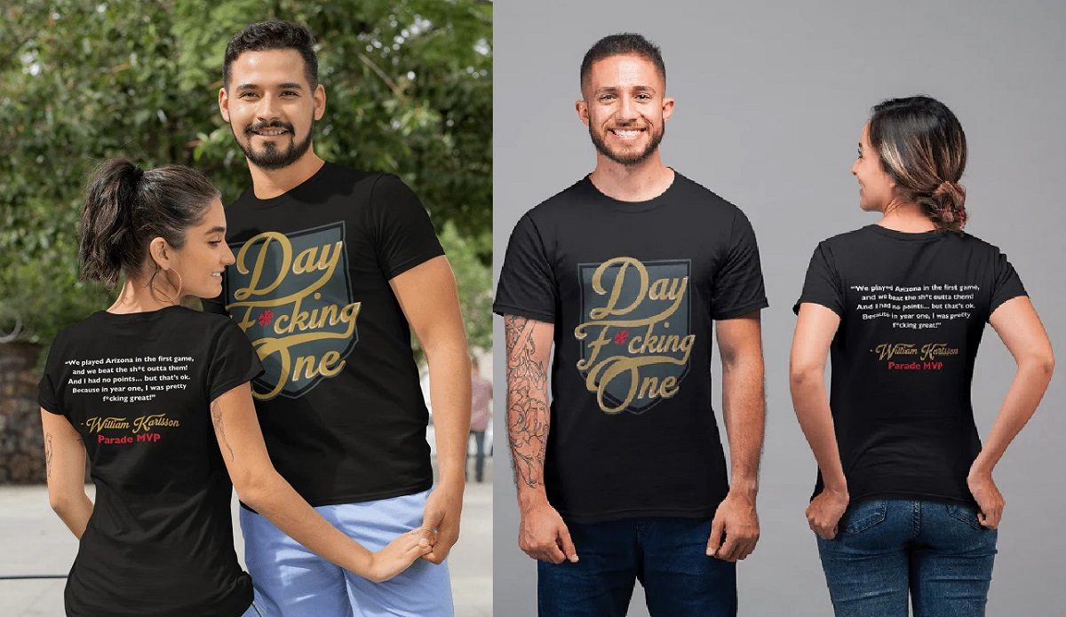
The Vegas Golden Knights logo has not only made an impact on the team’s branding but also on fan culture. From merchandise sales to social media reactions, fans have embraced this logo with open arms.
Fan merchandise sales statistics
Since 2017 the team first unveiled its logo, merchandise sales have skyrocketed. The team’s online store offers everything from t-shirts and jerseys to hats and home decor. According to a report by Fanatics, the official e-commerce partner of the NHL, the Vegas Golden Knights were one of the top-selling teams regarding merchandise sales during their inaugural season.
They were third overall behind only long-established franchises like the Chicago Blackhawks and Pittsburgh Penguins. It’s not just about making money, though.
Merchandise sales are a way for fans to show their support for their favorite team. And with a logo as unique and eye-catching as this one, it’s no wonder fans can’t get enough.
Social media reactions from Fans
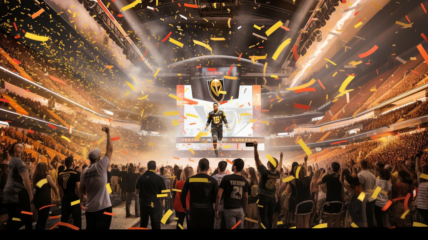
Social media has become a breeding ground for fan culture in recent years. And when it comes to the Vegas Golden Knights logo, fans have taken to Twitter and Instagram in droves. Social media is full of Golden Knights love, from photos of people sporting VGK gear at games or around town to selfies with statues of knights outside T-Mobile Arena.
Fans have even used hashtags like #VegasBorn and #KnightUp to connect online. Of course, not everyone is a fan.
As with most things on social media, haters are always lurking around, ready to rain on someone else’s parade. But for every negative comment or tweet about the logo or team itself, there are thousands more positive ones from die-hard VGK supporters.
Creative fan art inspired by the logo
The Vegas Golden Knights logo has also sparked creativity in fans beyond just merchandise and social media. Artists of all kinds have been inspired by this unique design.
Some fans have begun drawing or painting their logo versions, incorporating different colors or designs. Others have created digital art, making wallpapers or phone backgrounds featuring the VGK shield.
Perhaps most impressive, though, are the fans who have turned the logo into something entirely new. From homemade costumes to intricate sculptures, the Vegas Golden Knights’ shield has become a symbol not just of sports fandom but of creativity and inspiration.
All in all, fans have embraced the Vegas Golden Knights logo in a big way. Whether through merchandise sales, social media posts, or creative endeavors, this unique design has become a beloved team and fan culture symbol.
Conclusion
The Vegas Golden Knights logo is more than just a piece of art on a jersey. It represents the team’s identity, history, and values and has become essential to the fan experience.
A well-designed sports logo can unite people, create strong emotional connections, and influence fashion trends. A team’s logo’s impact on fan culture is immeasurable but undoubtedly significant.
Significance of a Well-Designed Sports Logo
A well-designed sports logo can make or break a team’s brand. It must be memorable, relatable, and versatile enough to be used across various platforms. A good logo design should also represent the team’s identity and values while appealing to fans’ emotions.
When fans see their team’s logo on merchandise or social media posts, they should feel proud to support their team. The Vegas Golden Knights logo checks all those boxes.
It has an impressive medieval theme that ties nicely with the city of Las Vega’s history and represents the knights’ code of honor: strength, unity, and teamwork. The steel grey color symbolizes resilience; gold means success and victory, while red conveys passion and determination – traits any successful sports franchise must possess.
However, designing a great sports logo isn’t easy; it requires creativity and skill to capture the essence of an entire franchise in one image. That being said, teams should invest time in creating unique logos as they ultimately impact fan engagement levels.
Impact That a Team’s Logo Can Have on Fan Culture
Sports logos are not only symbols but cultural icons that represent communities around them worldwide. A great example is how popular Chicago Bulls hats were worldwide during Michael Jordan’s heydays in basketball during the 1990s: their iconic ‘bulls head’ signifying fearlessness became synonymous with success in basketball. The Vegas Golden Knights logo, on the other hand, has become more than just a symbol of support for the team.
It has united fans and become a fashion statement in Las Vegas and beyond. People wear hats, t-shirts, and even tattoos with the logo on them as a way to express their love for their team.
Sports logos can also influence fashion trends. In recent years, sports-inspired clothing has become increasingly popular worldwide.
Fitness fanatics wear jerseys or hoodies with their favorite team’s logos as part of their everyday outfits. Your sports team’s logo is an essential aspect of branding that you cannot ignore.
A well-designed sports logo becomes more than just a symbol: it becomes an integral part of fan culture and represents the community around it. The Vegas Golden Knights logo is an excellent example that other teams could follow when creating their symbols to engage with fans better and make emotional connections between them and the community they represent.