
Introduction
Every sport has unique traditions and symbols representing a team’s identity. One of the most iconic elements is the team jersey, which symbolizes a team’s history, values, and spirit.
Jerseys have become an integral part of sports culture, creating a sense of belonging for both players and fans alike. In this article, we will take an in-depth look at the jerseys of the Vegas Golden Knights hockey team.
Brief History of the Vegas Golden Knights
The Vegas Golden Knights are relatively new to NHL (National Hockey League), having been established in 2017 as part of an expansion initiative. They quickly became one of the league’s top-performing teams with their high-energy style and impressive record. During their inaugural season, they managed to reach the Stanley Cup Finals but ultimately lost to the Washington Capitals.
Vegas Golden Knights jerseys go beyond just being uniforms; they also pay tribute to Las Vegas’ strong community spirit and resilience after facing adversity together. The tragic mass shooting that took place on October 1st, 2017, only a few days before their first home game, made them determined to bring hope and healing through hockey.
Importance of Jerseys in Sports
A jersey is more than just a piece of clothing; it signifies unity among players on a team and loyalty from fans supporting them from afar. It serves as an extension of a player’s pride, representing not just themselves but also their team’s name during every game.
Jerseys act as marketing tools for teams and leagues- fans buy them passionately, showing off their support while also generating revenue for these leagues or teams through merchandise sales. Since they’re so important in sports culture, jerseys have become iconic symbols associated with different generations within sports culture that transcend time throughout history.
Purpose of the Outline
This article aims to provide a detailed analysis of the Vegas Golden Knights jerseys. It will overview the primary, alternate, and special edition jerseys worn by the team in various games.
We will also examine how these jerseys reflect the team’s values and represent their city, culture, and fans. This article will be divided into seven sections to provide an in-depth understanding of each aspect.
By examining every detail of these jerseys- from design elements to colors used- this article aims to fully illustrate why they’re so iconic amongst sports fans worldwide. Through this extensive analysis, readers can better understand what makes a great sports jersey, as well as appreciate how these objects contribute not just visually but also emotionally to both players and fans.
Overview of Vegas Golden Knights Jerseys
The Vegas Golden Knights, a professional ice hockey team based in Las Vegas, Nevada, made their debut in the National Hockey League (NHL) during the 2017-18 season. Since then, they have become one of the most popular teams in the league and have amassed a large following of fans. One of the factors that contribute to their popularity is their unique and eye-catching jersey designs.
Primary Home and Away Jerseys
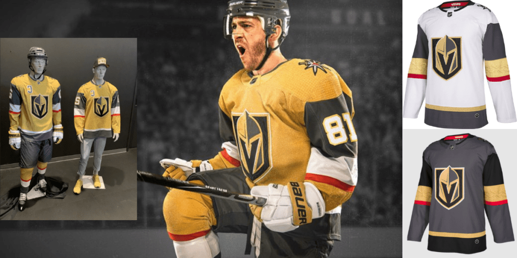
The primary home jersey for the Vegas Golden Knights features a black base with gold and silver accents. The team’s logo, which depicts a knight’s helmet with a “V” shaped slit at the top, is prominently displayed on the front of the jersey. The logo also appears on each shoulder pad as well as on each sock.
The primary away jersey has similar design elements to its counterpart but has white as its base color rather than black. The team’s colors are still represented through gold and silver accents throughout each section of this jersey.
Both home and away jerseys feature unique patches located at no other spot than on each inside collar neckline displaying “Vegas Strong”. On October 1st, 2017, Las Vegas faced tragedy when an attendee opened fire, killing 58 people attending a live concert nearby Mandalay Bay Resort & Casino.
Alternate Jerseys
In addition to their primary jerseys, the Vegas Golden Knights also have two alternate jerseys that they wear during games: one is primarily gold, while the other is mostly grey. The gold alternate jersey pays homage to Las Vegas’ nickname as “the golden city” It features black stripes along both sleeves adorned with metallic gold accents. This design element compliments an all-gold base color with additional grey hues featured throughout.
Meanwhile, their gray alternate jerseys are less commonly worn but still boast an excellent design featuring dark grey tones alongside silver metallic accents. The team’s logo is displayed on the chest in a slightly lighter gray tone.
Design Elements and Color Schemes
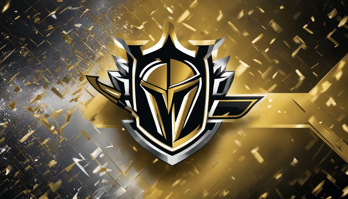
The design of the Vegas Golden Knights’ jerseys is both modern and unique. The team’s logo, which was designed by Adidas, incorporates several design elements that represent different aspects of Las Vegas’ culture and history.
For instance, the knight’s helmet represents strength and bravery, while the “V” shaped slit at the top represents Las Vegas’ nickname as “the city of lights.” Additionally, their color scheme pays tribute to Sin City, with black representing darkness and red symbolizing passion.
Another interesting aspect of the jersey design is its use of metallic gold accents. These accents are featured throughout each jersey but are more prominently displayed on the black home jersey where they represent golden lights against a dark night sky.
Overall, the Vegas Golden Knights have some of the most unique and visually striking jerseys in all of professional sports. Their designs incorporate elements from Las Vegas culture while also representing strength and bravery through their use of colors and imagery.
Primary Home and Away Jerseys
Description of Primary Home Jersey
The primary home jersey for the Vegas Golden Knights is a striking combination of grayscale colors with metallic gold accents. The jersey features a black base with gold stripes on the sleeves and waist, along with silver and red accents.
The team logo, a knight’s helmet with crossed swords, is prominently displayed on the chest in shades of metallic gold, silver, and black. The back of the jersey showcases the player’s number in large white font outlined in silver.
Above the number is a small patch that reads “Vegas,” adding an extra touch of hometown pride. Overall, this jersey design exudes power and strength while still being sleek and stylish.
Description of Primary Away Jersey
The primary away jersey for the Vegas Golden Knights features a predominantly white base with black stripes on the sleeves and waist. Similar to the home jersey, metallic gold accents are used throughout, including on the team logo displayed front and center. The back of this alternate jersey also displays each player’s number in large black font outlined in gold.
And similarly to their home jerseys, above each number is a small patch that reads “Vegas.” Overall, this away design provides a sharp contrast to their home look while maintaining consistency in its use of colors and metallic accents.
Significance of Color Choices
The color choices for both primary jerseys are deliberate and significant to both the city they represent as well as their team’s identity. Black serves as an ode to Las Vegas’ nightlife scene while also symbolizing strength and power.
Gold represents prosperity and success – two values that are important to Las Vegas’ culture as well as the sports teams representing it. Silver serves as an accent color representing technology which is one industry that has been growing significantly within Las Vegas recently.
Red adds bold contrast while also symbolizing the energy and passion of their fans. All of these color choices tie together to create a cohesive identity for the Vegas Golden Knights that reflects both their city and team values.
Alternate Jerseys
Description of Gold Alternate Jersey
The Vegas Golden Knights gold alternate jersey is an eye-catching design that is sure to turn heads. With its bold metallic gold color scheme, it stands out among other NHL jerseys. The base of the jersey is mostly black, with gold stripes at the bottom and on the sleeves.
The collar and shoulders are also outlined in gold. One unique feature of this jersey is its use of the spade logo on the front.
This logo represents Las Vegas’ rich gambling history, as a spade is one of the four suits in a deck of cards. The spade sits atop crossed swords, giving it a powerful and intimidating look.
The player numbers on this jersey are white with a black outline, making them easy to read from a distance. Overall, this alternate jersey exudes strength and confidence and is often worn during important games.
Description of Grey Alternate Jersey
The grey alternate jersey for the Vegas Golden Knights has a more subdued look compared to their other jerseys. However, it still manages to be stylish while maintaining a sense of sophistication.
The grey color scheme gives off a sleek and modern feel while still sticking to their team colors. Similar to their gold alternate jersey, this one features the Spade logo on the front.
However, instead of being centered on the chest like their other jerseys, it sits off-center near the heart for added symbolism. The player numbers on this jersey are black with white outlines, which helps them stand out against the grey background.
Additionally, there are small gold accents around each number which adds depth and dimension to an otherwise simple design. Overall, this grey alternate jersey strikes a balance between being understated yet impactful – it’s perfect for games where they want to focus more on performance than flashy aesthetics.
Significance Of Alternate Jerseys
Alternate jerseys serve not only as a way for teams to showcase their colors and logos with creative designs but also as a way to pay homage to the city or fans they represent. The Vegas Golden Knights have done an excellent job in creating alternate jerseys that not only look impressive but also carry significant meaning.
For example, both their gold and grey alternate jerseys feature the spade logo that symbolizes Las Vegas’ rich history. It’s a nod to the city’s gambling legacy while also representing strength and power on the ice.
Alternate jerseys are often worn during special games or occasions, such as outdoor games or playoff matches. They serve as a way for players to stand out from the rest of their teammates and opponents while representing their team with pride.
Overall, alternate jerseys are an important aspect of sports apparel that goes beyond just looking good on the ice. They allow teams to connect with their fans on a deeper level while showing off their creativity and style.
Design Elements and Color Schemes
The Vegas Golden Knights jerseys feature a unique design that sets them apart from other teams in the league. The team went through an extensive process to create a logo and color scheme that would represent the city of Las Vegas. The design was created by Adidas, who worked closely with the team to ensure that every detail was perfect.
Explanation of Team Logo on Jerseys
The team logo on the Vegas Golden Knights jerseys is a medieval knight’s helmet with a “V” shape in the center to represent the city of Las Vegas. The helmet is gold and black with red accents, giving it a bold and fierce appearance. It represents strength, power, and resilience – traits that are often associated with knights.
The “V” in the center of the helmet is also significant as it represents both Vegas and victory. The logo has become an iconic symbol for not only the hockey team but also for Las Vegas as a whole.
Use of Metallic Gold Accents
One of the most striking features of the Vegas Golden Knights jerseys is their use of metallic gold accents. This metallic color reflects off their helmets, pants, gloves, and numbers and creates an eye-catching visual effect under different lighting conditions. This was done intentionally to pay homage to Las Vegas’s reputation as “The Entertainment Capital of the World.” It also adds another layer of sophistication to an already impressive uniform design.
Significance Behind Black, Gold, Silver, and Red Color Scheme
The black color on their jerseys represents power and strength while also being sleek and modern. Meanwhile, gold is associated with victory; silver symbolizes intelligence; red represents aggression on the ice rink.
Together these colors embody qualities that reflect both Las Vegas culture as well as traits found within hockey players themselves – toughness, perseverance & winning mentality at all times. The Vegas Golden Knights jerseys are a true representation of the city and its people.
The team has managed to create a unique look that captures the spirit of Las Vegas while also paying homage to the sport of hockey. It’s no wonder why their jerseys are some of the most sought-after among hockey fans worldwide.
A Rarity in Jersey Details
The Hidden “Vegas Strong” Message on the Inside Collar
When the Vegas Golden Knights took to the ice for their first NHL game on October 6, 2017, they did so with heavy hearts. Just days earlier, a mass shooting had taken place in Las Vegas that claimed the lives of 58 people and injured hundreds more.
The team was determined to honor those affected by the tragedy and show their support for the city they represented. As a result, a subtle but powerful message was added to the inside collar of each player’s jersey.
The words “VEGAS STRONG” were stitched in gold lettering, providing a constant reminder of the resilience and strength of both the city and its residents. This small detail is just one example of how much thought and care went into designing these jerseys.
The 58 Stars on Their Helmets to Honor Victims from October 1st Shooting
In addition to the hidden message on their jerseys, another tribute was incorporated into their uniforms as well. Each player’s helmet features a decal with 58 stars, one for each person who lost their lives in the shooting that occurred just days before their inaugural game.
This simple yet poignant gesture serves as a reminder that even amidst tragedy and darkness, there is always hope for brighter days ahead. It also shows that sports can be a unifying force that brings people together in times of need.
Their Secondary Logo is a Spade which Represents Las Vegas’ Gambling History
The Vegas Golden Knights’s primary logo features an armored warrior holding a sword while wearing golden armor emblazoned with a “V,” representing both victory and Vegas. However, their secondary logo – which can be found on select merchandise and apparel – is equally meaningful. The logo consists of two crossed swords forming a spade, a nod to the city’s long history with gambling and casinos.
It’s a clever and unique way to pay homage to Las Vegas’ past while also representing the team’s identity and spirit. Overall, these small details may seem insignificant or easy to overlook at first glance.
But they serve as a powerful reminder of the strength and resilience of both the city of Las Vegas and its hockey team. They show that sports can be about more than just winning games – they can bring people together and serve as symbols of hope, unity, and pride.
Conclusion
The Vegas Golden Knights have captured the hearts of many fans since their inaugural season in 2017-2018. Their jerseys have been one aspect that has helped define their image on and off the ice.
From their primary home and away jerseys to their alternate designs featuring metallic gold accents, these uniforms are not only visually striking but also full of meaning. The hidden “Vegas Strong” message on the inside collar serves as a constant reminder of the city’s resilience in the face of tragedy, while the 58 stars on each player’s helmet honor those who lost their lives in one such event.
Even their secondary logo – featuring two crossed swords forming a spade – serves as a tribute to Las Vegas’ rich history with gambling and casinos. These jerseys are more than just fabric; they represent something much greater.
They embody what it means to be part of a team, part of a community, part of something bigger than oneself. And for fans who wear them proudly, they serve as symbols not only for hockey but for hope, strength, unity, and pride in all aspects of life.
Conclusion
Summary of Key Points about Vegas Golden Knights Jerseys
The Vegas Golden Knights have made quite a splash since entering the NHL as an expansion team in 2017. From their unexpected success on the ice to their iconic jerseys, the team has quickly become a fan favorite. In this article, we delved into the details of their unique uniforms and what makes them so special.
The primary home and away jerseys feature striking colors and design elements that reflect the team’s identity as Las Vegas’s first major professional sports franchise. The use of metallic gold accents and hidden messages, such as “Vegas Strong” on the inside collar, adds even more meaning to these already significant uniforms.
The alternate jerseys are just as impressive with their distinctive gold and grey tones and bold designs. These jerseys provide fans with even more options to show support for their beloved team.
Importance for Fans to Wear Their Team’s Colors with Pride
Wearing your team’s colors is a way to show your dedication and passion for your favorite players. It also creates a sense of unity among fans, connecting them through a shared love for their team.
When you wear your Vegas Golden Knights jersey, you become part of a community of passionate fans who take great pride in supporting their team. Not only does wearing your favorite player’s jersey make you feel like part of the action, it also helps support the team financially by contributing to merchandise sales.
Overall, investing in a Vegas Golden Knights jersey is not just about looking good; it’s about being part of something bigger than yourself. Show off your fan pride by donning one of these iconic jerseys at every game or watch party you attend!
An Optimistic Spin on What Lies Ahead
As we wrap up our discussion on Vegas Golden Knights jerseys, it is clear that they have set themselves apart with their unique and memorable designs. With each passing season, we can expect even more creativity and innovation from this exciting team.
In addition to their impressive on-ice performance, the Vegas Golden Knights have become a beacon of hope and resilience for the city of Las Vegas. Their jerseys are not just symbols of a successful expansion team, they represent the strength and unity of a community that has faced adversity and come out stronger on the other side.
So let’s continue to wear our Vegas Golden Knights jerseys with pride, supporting this incredible team as they make history in the NHL. The future is bright for this dynamic franchise, both on and off the ice!