The Impactful Arrival of the Golden Knights
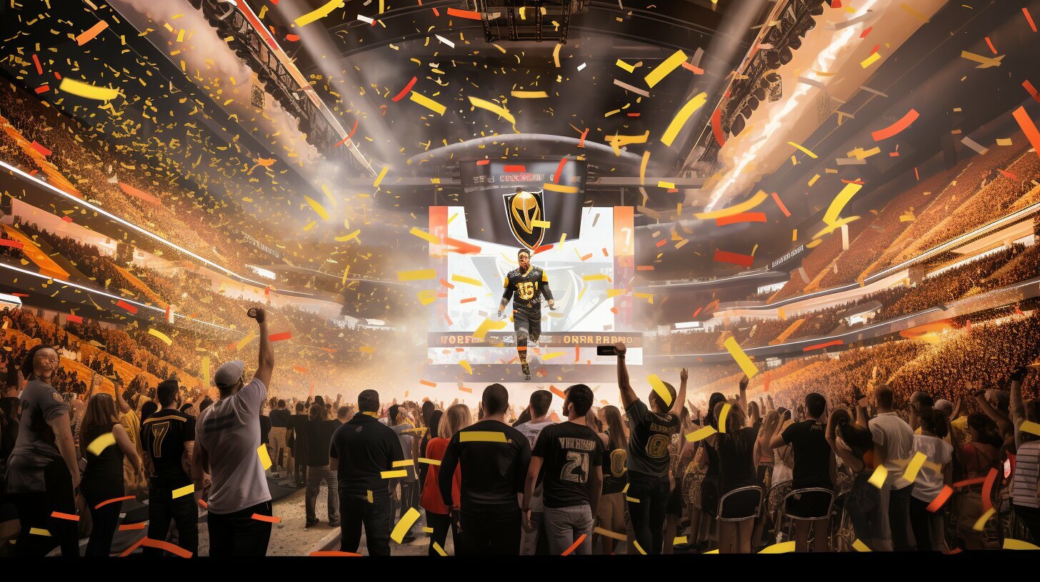
The Las Vegas Golden Knights burst onto the scene in 2017 as the league’s newest expansion team, ready to take on the established franchises of the National Hockey League. Despite low expectations from pundits and fans alike, the team quickly made a name for themselves with an impressive inaugural season that saw them finish atop their division and make it to the Stanley Cup Finals.
The impact of this Cinderella story was felt not only in Las Vegas but across the entire NHL landscape. This new franchise’s success was largely due to its talented roster and its unique branding and marketing efforts.
The Golden Knights embraced their city’s history and culture, incorporating elements such as a sword-wielding knight into their logo and featuring iconic landmarks like Red Rock Canyon in promotional materials. However, this attention to detail extended beyond just marketing; it also manifested in their jerseys.
The Significance of Jersey Design
Jerseys are a crucial component of any sports team’s identity. They serve as a representation not only of the players wearing them but also of that organization as a whole. In many cases, they can be just as iconic as logos or mascots.
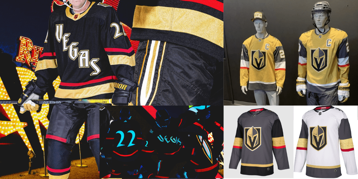
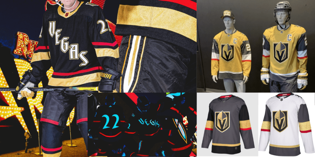
The Las Vegas Golden Knights are no exception – their jerseys have become instantly recognizable thanks to bold design choices and attention-grabbing color schemes. The primary jersey design features black as its base color, with gold accents on stripes and numbers.
White is also incorporated for contrast. This simple yet striking design is instantly memorable thanks to its use of negative space – large blocks of black broken up by thin lines or small patches of white or gold.
Beyond just aesthetics, there is meaning behind this design choice. Black is often associated with power, sophistication, and mystery – all traits the Golden Knights aspired to embody in their first season.
Meanwhile, gold is a nod to the city’s glittering reputation and status as a hub for entertainment and luxury. The white accents serve not only to provide contrast but also to represent hope and purity – two things that are surely needed when attempting to win a championship.
The alternate jersey takes things even further with a bold metallic gold color scheme that demands attention. This jersey is not for the faint of heart – it screams confidence and swagger.
It’s no wonder this design has become so popular among fans. The Las Vegas Golden Knights have left an indelible mark on the NHL with their on-ice success and attention-grabbing branding efforts.
Their jerseys are just one example of how this new franchise has injected fresh energy into an exciting league. From bold design choices to nods to local culture, these jerseys truly represent what makes the Golden Knights special.
The Main Jersey Design
Black, Gold, and White: The Perfect Combination
The Las Vegas Golden Knights’s primary jersey design is simply stunning. The black, gold and white color scheme is a perfect combination that exudes power and elegance. Black is the jersey’s base color, with gold accents on the sleeves, collar, and waistline.
White highlights are also used sparingly throughout the design to add contrast and balance. The choice of colors for this jersey design is not just aesthetically pleasing but also meaningful.
Black represents strength and power, while gold symbolizes victory and triumph – fitting for a team that has exceeded expectations since its inception into the NHL in 2017. White provides a clean slate for players to showcase their skills while adding a touch of class to an already impressive design.
A Design That Pays Homage to Las Vegas’ History and Culture
It’s not just about the colors used in this incredible jersey design – subtle nods to Las Vegas history and culture are incorporated. For example, the neckline features a stripe pattern reminiscent of playing cards – an homage to Sin City’s famous casinos.
Moreover, above each player’s name on the back of the jersey is a number with four dots on either side. These dots represent one dice roll short of a “five” or “six,” which is considered good luck in many cultures worldwide – including Las Vegas.
Additionally, on each sleeve is a patch featuring an image of two swords crossed over each other with a star at their intersection -recalling both medieval heraldry and imagery from Nevada’s state flag. There was much thought put into designing this masterpiece of a jersey.
Every aspect has been carefully considered to ensure that it looks great and represents the team and its home city meaningfully. The Las Vegas Golden Knight’s primary jersey design is a work of art that will stand the test of time.
The Alternate Jersey: A Shining Example of Uniqueness
The Introduction of Metallic Gold Jersey
As if the Golden Knights’ primary jersey wasn’t already stunning enough, the team decided to introduce an alternate jersey that takes things to a whole new level. The metallic gold color scheme is nothing short of eye-catching and stands out from other NHL teams’ alternates.
It’s bold, daring, and screams “Las Vegas.” The decision to go with a metallic gold color was a brilliant one.
It adds an extra shine and glamour that perfectly embodies Las Vegas’ glitzy persona. The overall design is sleek and modern, with subtle nods to the city’s iconic neon lights.
Analysis of How This Jersey Stands Out
Many teams play it safe with their designs regarding alternate jerseys in the NHL. They often opt for simple color swaps or variations on their primary jerseys. But not the Golden Knights – they took a risk with this one, and it paid off in spades.
The metallic gold jersey is unique, not just within hockey but among all sports uniforms. It’s flashy without being gaudy and simultaneously manages to be both modern and classic.
The black accents on the sleeves and collar add enough contrast without removing the main event: that shimmering gold fabric. But let’s not forget about the details – this jersey has them in spades too.
The word “Vegas” runs vertically down each sleeve, adding another layer of city pride to an already Las Vegas-centric design. And on the chest sits a bold patch featuring crossed swords (a reference to the team name) with an intricate starburst pattern behind them.
This alternate jersey is more than just a fashion statement – it represents everything that makes Las Vegas and the Golden Knights great. It’s bold, daring, and dares to be different.
The Special Edition Jerseys
Immortalizing Important Causes
Las Vegas Golden Knights have been known for their social consciousness and support for various causes. They have shown their support differently, but one of the most prominent ways has been through special edition jerseys. The team has donned jerseys to raise awareness about important causes, such as military appreciation and Hispanic heritage.
The military appreciation jersey is one of NHL history’s most iconic special edition jerseys. The jersey features a camouflage design with the American flag on the shoulders and a “Vegas Strong” patch on the chest.
The team wears this jersey annually to show gratitude towards military personnel and veterans who have selflessly served the country. Another special edition jersey that deserves recognition is the Hispanic Heritage Night Jersey.
This vibrant yellow and black-colored jersey features a luchador mask on the shoulders with “Viva Las Vegas” written on it. This jersey celebrates Hispanic culture while supporting all Latinx people in Las Vegas.
Combining Innovation With Style
The Golden Knights have focused on showcasing important causes and ensuring that their special edition jerseys stand out from others in style and design. These jerseys often feature unique color schemes, patterns, or materials that distinguish them from regular-season jerseys. One example is the gold-trimmed white road alternate uniform which debuted during the 2019-20 season.
This alternate uniform has become an instant fan favorite due to its striking appearance featuring metallic gold accents around a clean white background. Another example is when they introduced ‘Reverse Retro’ jerseys during the 2020-21 season, featuring gold as the primary color instead of black, a major shift from traditional uniforms where gold had always served as an accent color only.
Underscoring Community Values
The Las Vegas Golden Knights’ special edition jerseys are not just about supporting important causes or innovation in design but also about highlighting community values. The team has always included local elements and culture in their uniforms.
One of the best examples is the City National Arena jersey, which features an outline of Nevada with a star representing Las Vegas. This unique and subtle design pays homage to the state and city where the team was born.
Their two-tone grey jerseys with red accent color during the 2021-22 season were dedicated to honoring workers who played a vital role in developing the practice facility. The jersey contained the numeral ’88’ on the right arm, marking the inauguration year of City National Arena.
Conclusion
Overall, Las Vegas Golden Knights’ special edition jerseys have been a testament to their commitment to supporting various causes and communities. Their innovative designs and unique color schemes set them apart from other NHL teams’ alternate uniforms. These jerseys are stylish additions to any fan’s collection and are important symbols of social consciousness for various groups nationwide.
Rarely Known Details About The Jerseys
Behind the Design: Secret Meanings in the Golden Knights Jerseys
While many hockey jerseys feature simple designs, the Golden Knights jerseys have hidden meanings and symbolism. Take a closer look at the team’s primary jersey design, for example. The black and gold stripes represent the “Welcome to Fabulous Las Vegas” sign, a staple of Sin City’s iconic skyline.
Meanwhile, the white stripes are meant to evoke the glimmering lights of Las Vegas Boulevard. But that’s just scratching the surface.
Look closer at the gold accents on both jerseys; you’ll see that they feature a unique pattern reminiscent of chain mail armor. This nods to medieval knights, tying into the team name and Las Vegas history as an entertainment hub featuring shows like “Excalibur” and “Medieval Times.”
The Unique Materials Used in Production
It’s not just designed elements that make Golden Knights jerseys stand out; it’s also what they’re made of. Specifically, Reebok used a new type of fabric called “EDGE” when constructing these jerseys, making them significantly lighter than previous NHL jerseys. This isn’t just about aesthetics; lighter jerseys can lead to better performance on the ice by reducing players’ fatigue during games.
Additionally, some fans appreciate knowing that their favorite players wear high-tech gear rather than simply sporting glorified t-shirts. There are other unique details in production worth mentioning as well. For example, all player names and numbers are heat-pressed onto each jersey rather than sewn on for maximum durability and comfort.
The Unconventional Inspiration Behind Special Edition Jerseys
While some special edition sports jerseys play it safe with basic color swaps or simple patches added to existing designs, Golden Knights’ special editions have gone above and beyond. Take the team’s military appreciation jerseys, for example. Rather than simply featuring camouflage accents or a subtle nod to our service members, these jerseys feature a bright green base with digital camo accents and an American flag prominently displayed on the shoulder.
This choice may ruffle some feathers – it’s not exactly subtle – but it sends a clear message that the Golden Knights stand with our troops and are proud to show their support. Similarly, special edition Hispanic heritage jerseys feature bold reds and greens meant to evoke Mexican culture, complete with “Los Golden Knights” printed across the chest.
The Golden Knights aren’t afraid to take risks regarding special edition jerseys. While some fans may prefer more traditional designs for these events, something is refreshing about seeing a team go all-out in their efforts to honor different cultures and communities.
The Bottom Line: Golden Knights Jerseys Are More Than Just Clothes
From design inspiration rooted in Las Vegas history to unique materials used in production and unconventional special editions honoring diverse communities, there’s no denying that Golden Knights jerseys are special. These aren’t just clothes you wear on game day – they’re statements of pride, symbols of support for your favorite team and its values. Some may argue that sports merch is overpriced or frivolous; after all, why spend money on a piece of fabric when you could put those funds towards more practical purchases?
But at the end of the day, what we wear can impact how we feel about ourselves and how others perceive us. So if donning a Golden Knights jersey makes you feel like part of something bigger than yourself – whether that’s your city or your favorite sports team – it’s worth splurging on.
Conclusion
Throughout this article, we have explored the intricacies of the Las Vegas Golden Knights jerseys and what makes them truly special. From the main jersey design to the alternate jersey and various special edition jerseys, it is clear that a great deal of thought and care went into designing each one.
The main jersey’s black, gold and white color scheme perfectly captures the essence of Las Vegas. The alternate jersey’s unique metallic gold color scheme is flashy yet sophisticated, making it stand out from other NHL teams’ alternates.
And let’s not forget about the special edition jerseys that honor different aspects of Las Vegas culture and history. But what truly sets these jerseys apart is their ability to bring people together.
Whether you’re a die-hard hockey fan or just someone looking for a cool piece of memorabilia, wearing a Golden Knights jersey instantly makes you part of a community. It represents your love for hockey and your connection to one another as fans.
In a world that can often feel divided and chaotic, it’s refreshing to have something that unites us all. So whether you’re cheering from home or lucky enough to be watching live at T-Mobile Arena, wear your Golden Knights jersey with pride, knowing that you are part of something truly special.